|
|
Blogroll
|
|
Most recent articles |
|
Highlights |
|
States and Economies |
|
World economies: 15 of 50 largest economies are U.S. States: |
|
World States – Table 1 |
|
History and Society |
|
Fourth of July aboard the W.W. II aircraft carrier the U.S.S. Hornet |
|
A. L. Kroeber's The Civilization of California's Far Northwest |
|
The Arab Admiralty – and an Arab naval view of the Crusades |
|
Excerpt from “The Wife of Bath's Prologue” by Geoffrey Chaucer |
|
“Horsey” Vikings: exploring origin of the “Rohirrim” in The Lord of the Rings
|
|
The Battle of Crécy by Winston S. Churchill |
|
Monotheistic Paganism, or just what was it Christianity fought and faced? |
|
Medieval constipation advice for travelers: “A ripe turd is an unbearable burden” |
|
Alexis de Tocqueville's bicentennial: Anticipatory censorship in colonial America |
|
Antiquity vs. Modernity: Alexis de Tocqueville on the mind of the slaveholder vs. soul of America |
|
Federalism, and Alexis de Tocqueville on the origins of American democracy |
|
Science, Technology, Space |
|
Looking in the right direction – towards the future – with regard to global warming |
|
Know Your Neighborhood: from Andromeda to Fermions and Bosons |
|
Magnetars and Pulsars: Science's special section on pulsars |
|
The Geneva-Copenhagen Survey of Sun-like Stars in the Milky Way |
|
Galactic Central: the Black Hole at the Center of the Galaxy |
|
Politics and War |
|
America’s strong arm, wielding the Sword of Iraq, slays the multi-headed Hydra of Al Qaeda |
|
Regional and Personal |
|
Tamara Lynn Scott |
What wailing wight
Calls the watchman of the night?
William Blake
Whirl is king
Aristophanes
“Jumping into hyperspace ain't like dustin' crops, boy.”
Han Solo, another galaxy
|
Blogroll |
|
Grand Central Station |
|
Legal and Economic |
|
History and Society |
|
Science, Technology, Space |
|
Politics and War |
|
Eclectic |
|
Regional |
|
Reciprocal |
© Copyright 2002 – 2009
Michael Edward McNeil
Impearls: Map of Mars
Item page — this may be a chapter or subsection of a larger work. Click on link to access entire piece.
Earthdate 2005-06-20
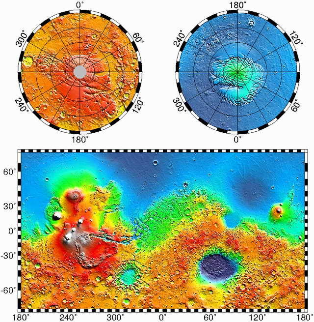
While on the subject of Mars (see the next posting for that earlier piece), above is a strikingly beautiful, relatively recent (from a few years ago) map of the Red Planet, that I suspect few people have as yet encountered, derived from the Mars Global Surveyor spacecraft's MOLA (Mars Orbiter Laser Altimeter) instrument, which for the first time puts together a detailed look at how the elevations of the terrain on Mars stack up with respect to each other. The color-coding legend shown at the top of the map extends from −8 kilometers (−5 miles) below the standard “datum” to +8 km above that level, while latitude and longitude on the map proper are indicated in 5° increments for the Mercator projection portion, and 10° for the polar projections (left one is south, right for north).
Click on the map to link to a larger version at NASA with surface elements labeled (I like it better without the labeling, frankly). See also this link to the NASA “MOLA” homepage, and this one for the MOLA Image Gallery. On the Image Gallery page, don't miss the large scale maps, particularly here (at 1,080 × 620 pixels), and here — for 12,032 × 6,912 pixels (careful, it's a 17.6 MB file!).
Using the MOLA data, researchers can now discern, for instance, how the descending altitude of apparent streambed valleys really could have conducted water down their courses back during warmer-wetter days on Mars; and it's also possible to compute how three-quarters of the martian terrain during such earlier times would have drained down to the “northern lowlands” (purple-blue along the top portion of the map), where oceans — if ever there were any on Mars, as seems increasingly likely — would have resided.
Taking inspiration from Edgar Rice Burroughs' “John Carter of Mars” stories of our youth, those northern lowlands (plus the enormous impact basin in the southern hemisphere known as Hellas) would have constituted the martian “dead sea bottoms” of yore and lore!
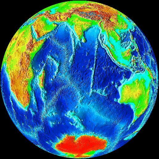
Also, for illustrative purposes, below is a view of our own planet using a similar altitude-coding representation (not precisely the same altitude scale). Notice how Antarctica appears red, not due to some weird false-color rendering of its coldness, but because the continent is so high altitude-wise: it's covered by an average of 6,500 feet (2,000 meters) thickness of glacial ice. (Click on the map to link to John Walker's “Earth Screen Saver for Windows,” the source of the image.)
| (Blank last screen) |
|
2002-11-03 2002-11-10 2002-11-17 2002-11-24 2002-12-01 2002-12-08 2002-12-15 2002-12-22 2002-12-29 2003-01-05 2003-01-12 2003-01-19 2003-01-26 2003-02-02 2003-02-16 2003-04-20 2003-04-27 2003-05-04 2003-05-11 2003-06-01 2003-06-15 2003-06-22 2003-06-29 2003-07-13 2003-07-20 2003-08-03 2003-08-10 2003-08-24 2003-08-31 2003-09-07 2003-09-28 2003-10-05 2003-10-26 2003-11-02 2003-11-16 2003-11-23 2003-11-30 2003-12-07 2003-12-14 2003-12-21 2003-12-28 2004-01-04 2004-01-11 2004-01-25 2004-02-01 2004-02-08 2004-02-29 2004-03-07 2004-03-14 2004-03-21 2004-03-28 2004-04-04 2004-04-11 2004-04-18 2004-04-25 2004-05-02 2004-05-16 2004-05-23 2004-05-30 2004-06-06 2004-06-13 2004-06-20 2004-07-11 2004-07-18 2004-07-25 2004-08-22 2004-09-05 2004-10-10 2005-06-12 2005-06-19 2005-06-26 2005-07-03 2005-07-10 2005-07-24 2005-08-07 2005-08-21 2005-08-28 2005-09-04 2005-09-11 2005-09-18 2005-10-02 2005-10-09 2005-10-16 2005-10-30 2005-11-06 2005-11-27 2006-04-02 2006-04-09 2006-07-02 2006-07-23 2006-07-30 2007-01-21 2007-02-04 2007-04-22 2007-05-13 2007-06-17 2007-09-09 2007-09-16 2007-09-23 2007-10-07 2007-10-21 2007-11-04 2009-06-28 2009-07-19 2009-08-23 2009-09-06 2009-09-20 2009-12-13 2011-03-27 2012-01-01 2012-02-05 2012-02-12


0 comments: (End) Post a Comment